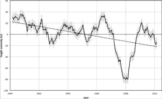
Scientists at the University of Auckland in New Zealand analyzed the first 10 years of global cloud-top height measurements (from March 2000 to February 2010) from the Multi-angle Imaging SpectroRadiometer (MISR) instrument on NASA’s Terra spacecraft. The study, published recently in the journal Geophysical Research Letters, revealed an overall trend of decreasing cloud height. Global average cloud height declined by around one percent over the decade, or by around 100 to 130 feet (30 to 40 meters). Most of the reduction was due to fewer clouds occurring at very high altitudes.which also illustrates the fact that once an instrument is available to measure something, it will be measured and analyzed and its entrails examined.
Supposedly, this demonstrates that cloud heights are getting lower and that this is a sign of global cooling. Now, cloud heights may indeed be getting lower and the world may indeed be cooling since the great El Niño of 1998, but that MLT on the graph is almost entirely an artifact of the Big Dip ca. 2008.
 |
| Engineering location benchmark, sometimes mistaken for rifle scope crosshairs |
Suppose a drill is set up to make a hole at the x-y location shown on the left. Normal machine vibrations will cause deflections in both the x- and y-directions, resulting in a cloud of points around the targeted location. Since the vibration is commonly present, this pattern is called common cause variation. If however, the machine is damaged in some way that the spindle comes down off the perpendicular, we will get holes outside the normal pattern of random deflections. This is called special cause variation.
Common Cause (Random) Variation
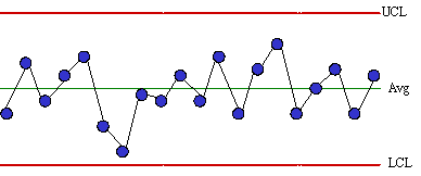
Random variation is a tug-of-war between a thousand munchkins. Some pull left; some pull right. The rope moves a bit this way or that, but mostly (say 67%) stays "near" the center. If we have a means of estimating short-term variation (which we may usually take as being essentially random) we can calculate probability limits for the long-term variation. Two common ways of estimating short-term variation are- by successive differences (i.e., between consecutive pieces off the drill press)
- by rational subgroups (i.e., samples from a larger stream for which machine, operator, environment, material, etc. were essentially constant)
 |
| A process experiencing only random variation Upper and lower control limits (UCL/LCL) are calculated from estimates of short-term variation, such as the range between consecutive points. |
Special Cause (Assignable) Variation
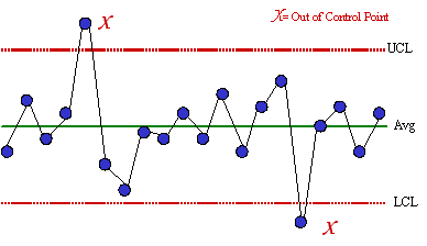
Assignable variation can be "assigned" to a specific cause. It is as if Arnold Schwarzenegger joined the aforesaid tug-of-war between the thousand munchkins. Some pull left; some pull right. Whichever way Arnold pulls, the rope goes. See the graph of cloud heights and look at the Big Dip of 2008. That was a special cause situation.  |
| A process experiencing assignable variation Special causes generally knock data outside the control limits, which represent three standard deviations of random variation |
Back to the Clouds
So let's take another look at the cloud heights. The experienced eye notes two likely events. (Aside from the optical illusion that the "center" line is trending upward.) At about 2001, there is a step-change, or "shift." The mean residual cloud height (called by climate scientists for some reason the mean "anomaly") was running an average of about 30 then dropped to a mean of around 10. Mentally superimpose a set of control limits like unto the first chart above onto the first year's data, then onto the second year's data. Both seem to be stationary series around 30 and 10, resp.
Except for the Big Dip (and possibly a Small Dip, 2003) the remainder of the chart seems remarkably stable. IOW, you could fair a median through the remainder of the data, calculate control limits and get something a bit like the second chart above: a stationary series with spikes and outliers. Without the raw data, more cannot be said. But, block the first year and the Dip with your hands and see what you think.


Agreed.Too sensible to be believed.
ReplyDeleteOff topic: The Razor's Edge is "in the can." When does it get out of the can and over to us??
Probably one year.
DeleteYes! Thank you for the proper statistics smackdown. I linked and tried to explain why this kind of mistake is particularly common and pernicious when dealing with time-series data on my own blog.
ReplyDelete