"[M]en are always powerfully affected by the immediate past:
one might say that
they are blinded by it."
-- Hilaire Belloc
Unless you are fractal, scale matters. Percival
Lowell thought he saw canals on Mars. Partly, this was because he
wanted to see canals on Mars; but partly too it was because at the scale
his telescopes could resolve a bunch of otherwise unconnected dots
seemed to form lines.
Consider Seurat's A Sunday Afternoon on the Island of La Grande Jatte. It is no coincidence that quantum mechanics developed not too long afterwards. Quanta were in the air, so to speak and artists often intuit before scientists think.
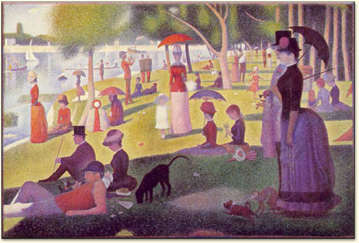 |
| Sunday Afternoon on the Island of La Grande Jatte (Un dimanche après-midi à l’Ile de la Grande Jatte), Georges Seurat, 1884-1886. |
From a certain distance, we see a solid picture. But now focus closely on the dog. Look at the location just above the dog, at the edge of the shadow. Look closely.
 |
| Grande Jette, detail edge of shadow above the dog. |
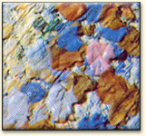
and what was one a solid picture has resolved into teeny quanta of individual color. Nevertheless, as the 'canali' on Mars, these points coalesce into a picture. The itch that wants to be scratched is whether that picture is an illusion [Lowell's canals] and when it is real [Seurat's picture].
One possibility is human intention. One school of thought holds that intention is not real and beings only do what external laws of physics cause them to do. (There are also those who hold that causation is unreal, which makes cons in which both gather an interesting object of study.)
A lever to move the world.
Archimedes is said to have claimed that, Πᾷ βῶ, καὶ χαριστίωνι τὰν γᾶν κινήσω πᾶσαν. (Give me a place to stand and with a lever I will move the whole word. (The Library of History of Diodorus Siculus, Fragments of Book XXVI, as translated by F. R. Walton, in Loeb Classical Library (1957) Vol. XI.) This is 1st cent. BC, two centuries after ol' Archie. So the historian may wonder if he ever actually said this.
The rest of us will wonder, where is this privileged standing place?And how long of a lever?
So what has this got to do with statistics?
A good question. No time plot is worthwhile without a reference line of some sort. Some choice choices include:
- The mean (median) of the data set itself. This is useful for determining whether a supposedly stationary series is in fact stationary. If there is no reason to suppose stationary, a supposed trendline or cycle may be used. This method, coupled with estimates of short-term variation, can analyze the series for assignable causes.
- A nominal, or target value set by an outside authority. This is useful for manufacturing processes intended to produce uniform pieces. Coupled with the limits mentioned above, it can determine whether a fluctuation signals a process off-target or merely a chance fluctuation.
- The mean (median) of some chosen prior data. This is a combination of 1 and 2
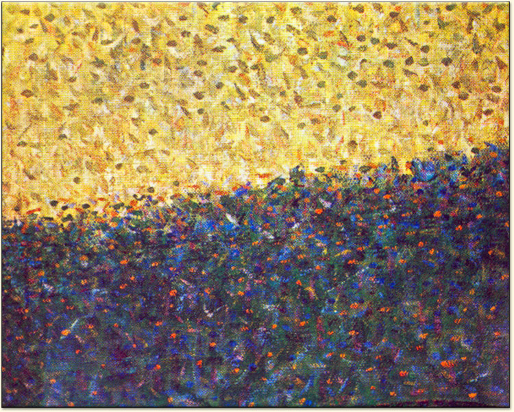
The Grand Jatte
Here is a long-view of global temperatures and carbon dioxide running back to nearly 450,000 years before present (ybp). Temperatures and CO2 are reconstructed from Antarctic ice cores. The centerline is the mean temperature for 1960-1990. The graph shows the world coming out of an ice age (again.) The normative period indicates 1) when must of us were kids and 2) when thermometer records became reliable in First World countries.

The Shadow of the Dog
Here is a closer look at temperatures and CO2: The Greenland ice core data since 11,000 ybp:

The upper chart is reconstructed
temperature and shows (vertical green stripes) the a) Minoan, b) Roman,
c) Medieval, and d) Modern Warm periods. In between are the 1) collapse of the
pristine states, 2) the collapse of the Han and Roman empires, and 3) the Little Ice Age. Except for the Warm Period spikes, the overall trend since Minoan times
has been downward. Each Warm spike is cooler than its predecessor; except
possibly the current one, which has gotten back to medieval and even maybe Roman temperatures. However, we should beware of comparing temperatures obtained from thermometers to those obtained from ice cores.
The lower chart is
of atmospheric CO2, also from the ice cores. CO2 began increasing starting about 7000 ybp, at the
same time the temperatures were cooling off, although the CO2 stops short of the temperature chart. This may be an artifact of the method of sampling the air trapped in bubbles in the ice. There is no appreciable
correlation with the Warm spikes. We might also wonder whether this trend is localized to the northern hemisphere, or even just to Greenland. (Or whether the previous Vostok ice cores represent only the southern hemisphere and/or Antarctica.)
(This also illustrates the
technique of Stacked Charts, versus the first look, which illustrated
the technique of Overlaid Charts. TOF prefers stacking charts unless
both are of the same kind of data on the same scale. Charts with
dissimilar scales can be confusing, although TOF has used them of
occasion.)
Dabs of Paint
A closer look still --
at a 140 ybp scale -- and the temps once more seem to match the CO2. These are not the raw thermometer data. They have been kriged and otherwise adjusted to accommodate missing station data and apparent outliers in the numbers (e.g., uncalibrated or broken thermometers, heat island effects, etc.)
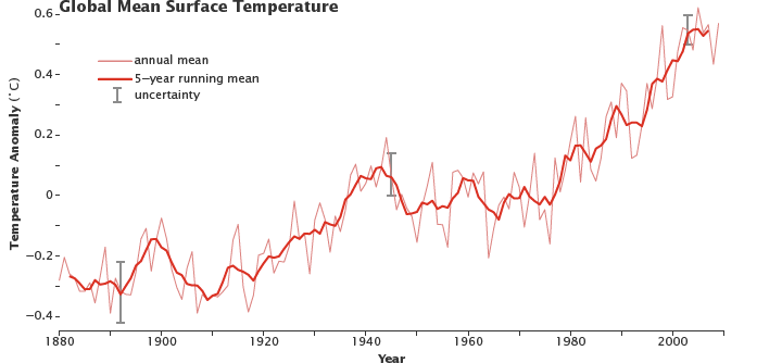 |
| "0" = mean for yrs 1951–1980. (NASA figure adapted from Goddard Institute for Space Studies Surface Temperature Analysis.) |
L'Envoi
The question arises: which scale is the right scale for considering these things? Look too close and random fluctuations loom as stupendously important; look too broadly and you see canals on Mars.


Pointillism, you know, was pretty much irrelevant to quantum mechanics. Seurat et al. began fiddling about with that technique in the mid-1880s, about five years after halftone printing became a mass-market technology. If you want to look for the analogues of quanta in the visual arts, you can look at the photograph of Prince Arthur printed by the Canadian Illustrated News in 1869:
ReplyDeletehttps://en.wikipedia.org/wiki/Halftone#/media/File:Canadian_Illustrated_News_Volume_1_Number_1_Cover.jpg
As far as I can quickly determine, this was the first commercially successful mass printing of a photograph rendered by a halftone process. The ‘quantum idea’ was circulating even then, if you like, but physicists wouldn’t trouble their heads about it until the so-called ultraviolet catastrophe revealed the fatal flaw in classical mechanics.
Here is more data one may compare with: https://www.carbonbrief.org/factcheck-what-greenland-ice-cores-say-about-past-and-present-climate-change
ReplyDeleteThis comment has been removed by a blog administrator.
ReplyDelete