1. Preliminary
Radiosonde balloon measurements are in remarkable agreement with satellite measurements of temperature during that period when both were in use. Here is the balloon data compared to both Univ. of Alabama-Huntsville (UAH) and Remote Sensing Systems (RSS), both of which are satellite-based. This argues that either a) both the balloon and satellite measures are wrong by the same amount in the same direction, year after year; or b) they both accurately reflect real temperatures. That said, radiosonde measures prior to the satellite system can be used with some confidence.
2. In an Age Before the Age
That is, in the age before science became political science. This chart of northern hemisphere temperatures appeared in National Geographic in 1976. The zero-line was the then-present day temperature because the world is always supposed to be the way it is right now. (Or else it is always supposed to be the way it was when we were growing up.) There are undoubtedly psychological reasons for this.
Matthews called attention to the fact that temperatures had been steadily declining since around 1938. During the torrid 1940s there was open water at the North Pole and the Soviet Union was saved from the Nazis in part because because the Archangel Route was ice-free. Articles appeared in the New York Times worrying about the warming.
But by 1976 the opposite worry had set in. See John Gribbin's Forecasts, Famines, and Freezes for details. Colder was worse. It shortens growing seasons, inhibits plant growth, and the like. In 1974, the US Science Board declared "During the last 20 to 30 years, world temperature has fallen, irregularly at first but more sharply over the last decade." What to do?
3. Saved from Global Cooling!
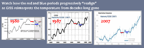
Obviously, if a cooling trend is bad, we must eliminate the cooling trend. This was done posthumously, as it were, by retrospective adjustments to the old data. Here are successive graphs from GISS:
GISS uses a temperature adjustment algorithm which adjusts data that are decades old. In this manner the 1938-1978 decline, observed around the world, has been successively diminished and finally eliminated. We have been saved from the cooling!
But there is a slight cheat in the above display: the vertical and horizontal scales differ and this tends to exaggerate the decline in the earlier graph and hide the decline in the third graph. However, this is only a visual quibble because the numerical values were:
Mathews Graph 76: 1955 – 1965 abt. 0.30C warmer than 1970’s
Hansen/GISS 1980: 1955 – 1965 abt. 0.10C warmer than 1970’s
Hansen/GISS 1987: 1955 – 1965 abt. 0.05C warmer than 1970’s
Hansen/GISS 2007: 1955 – 1965 abt. 0.03C cooler than 1970’s
So instead of a 0.30 deg drop in temp, we now have a 0.03 deg warming from the earlier time to the later. But "hardly a man is now alive who remembers that famous day and year" and the pravda now is that the decline from the 1940s to the 1970s was no big deal. (See? Here's the [adjusted] data!) And there never was a big global cooling scare. Nothing to see here. Move along.
Larger versions of the graphs can be found at wattsupwiththat. The clientele in the commbox there are a bit more intemperate than I, but also some Name scientists occasionally stop by.


No comments:
Post a Comment