Now and then, one reads that the average American is a woman. There are certain construals under which this might be true; but social criticism is not today my theme. My theme is, yes, wait for it: statistics, more fun than which is impossible to have sitting down.
In dynamic processes, the distinct strata may be subsumed within the periodic samples or may appear as distinct fluctuations or shifts from time to time. In this case, calculating a constant mean for the series can be a fatuous exercise, though often done simply to provide a benchmark against which to view the fluctuations and to test the null hypothesis that the mean value is constant for the series.
Consider the following: a machine applies a lead oxide paste onto a lead grid to make the innards of an automotive battery. (Let's hear it for battery-powered cars! And no, nickel and cadmium and the rest aren't any better. We know how to treat lead poisoning.) As part of a study, samples of five consecutive grids are taken every fifteen minutes. The variation among the five grids in each subgroup is taken as an estimate of short term, cycle-to-cycle variation of the machine. This is taken, secundum argumentum, as random variation.
From this, by sundry means of the Statistician's Black Arte, which I could teach you, but then I would have to brick you inside the wall of the wine cellar, we can calculate the limits within which we would expect the subgroup means to fluctuate if the random variation were all there were. The chart asks the musical question: is there more variation from quarter-hour to quarter-hour than there is on the average from stroke-to-stroke. Here is the answer: The variation among the 24 subgroups is greater than would be expected from the short-term variation. The points go outside the 3-sigma limits and betray certain other improbable patterns.
 Note that while the grand mean is 7.32 (in coded values: this is real data), there is no sense in which we might say "The pasting process maintained a process level of 7.32." Maybe it was briefly true at 4:30. There are clear changes in the process level. Of the first twelve means, all but two were below the grand mean. Of the second twelve means, all but one were above the grand mean. We conclude that some action was taken around 4:00 PM that raised the overall average. This turned out to be a change in the density of the lead oxide paste that was being metered into the machine. There had been a change in the paste mill and the same volume of paste was resulting in heavier paste weights on the grids.
A closer inspection reveals something more interesting: a "leap" in the mean value at each hourly sample. Between the hours, there is much less variation. This was due to the machine operator diligently adjusting the machine just before the QC patrol inspector was scheduled to come by for the control sample. (We were doing a special study, and thus in some odd sense "invisible.")
Now suppose we wanted to know about the machine's capability regardless of these two assignable causes - the change in paste density and the operator's well-intended tampering? The way we would do this would be to calculate the mean of each hour and plot not the sample means but the deviation of the sample means from its own hourly mean. Such deviations are technically called "deviations" (and, with a bit of math, compared to a "standard" deviation); but they are also commonly called "residuals." The chart of residuals looks like this:
 As you can see, it is "in control," meaning the long term variation is no greater than the short term variation (everything fits between the 3-sigma limits) and the grand mean really does look like a central tendency. IOW, once we have addressed the oxide density and the operator adjustments the process becomes a nicely predictable stationary time series. It also plots as a straight line on normal probability paper, and so is consistent with the assumption that the residuals vary normally around a mean of zero.
With this in mind, interested readers are welcomed to examine the following time series:
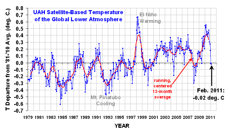
These are satellite-based temperatures of the lower atmosphere. Dr. Roy Spencer describes the actual measurements with admirable concision.
NOAA satellites have been carrying instruments which measure the natural microwave thermal emissions from oxygen in the atmosphere. The signals that these microwave radiometers measure at different microwave frequencies are directly proportional to the temperature of different, deep layers of the atmosphere. Every month, John Christy and I update global temperature datasets that represent the piecing together of the temperature data from a total of eleven instruments flying on eleven different satellites over the years. As of early 2011, our most stable instrument for this monitoring is the Advanced Microwave Sounding Unit (AMSU-A) flying on NASA’s Aqua satellite and providing data since late 2002. ... [T]he satellite measurements are not calibrated in any way with the global surface-based thermometer record of temperature. They instead use their own on-board precision redundant platinum resistance thermometers calibrated to a laboratory reference standard before launch.
For reasons unknown, "climate scientists" call their residuals "anomalies." The data points are monthly, and each month is compared to the mean value for that month for 1981-2010. That is, a mean is computed for Jan 81, Jan 82, ..., Jan 10, and each Jan average is compared to this grand mean. And so on for each month. The result is to filter out the summer-winter temperature changes and center the chart on 0. This is what we did above when we did hourly averages to eliminate the end-of-hour adjustment by the operator. Thus, there is no seasonal fluctuation in the residual time series.
There are no control limits because climate scientists have evidently never heard of Walter Shewhart and his seminal work on dynamic statistics at Bell Labs. (Actually, hardly anyone has.) Instead, we see constant means, linear regressions, linear extrapolations, and the like. Yet the data clearly indicates there are multiple regimes in the data. There are spike events - warmists tout the up-spikes, skeptics tout the down-spikes. There is a cycle of approximately 3.75 years (irregular: most often 3-5 years between peaks; and two peaks were suppressed by something). What the record is not is:
a) constant, meaning only random variation; or
b) a steady linear trend upward correlating with CO2, meaning only a single important X.
Now, of course, the CO2 must have some effect, so there must be a trendline buried in there somewhere; but there are clearly assignable causes in the process not yet identified. By not including them in the model, the fluctuations due to them are assigned to the included factors, thus exaggerating their influence.(*) This is the hazard of starting with a model and working toward the data, rather than starting from the data and identifying assignable causes. When the climate then does the unexpected, the unpredicted, one must run about modifying the model to accommodate it.
(*) Added note. This is inherent in modeling. "With seven factors you can fit any finite set of data." Most of the variation (r²) will be assigned to one or another of the factors (or to their interactions) with very little left over (1-r² will be small). Hence, if an eighth factor is proposed, a first blush would say that there is no remaining "unexplained" variation that it would need to account for. But this is just a "first derivative" version of confusing correlation with causation. If the multiple regression were re-run with the eight factors included, a new equation would be generated with different coefficients and would still have an r² accounting for "nearly all" the total variation. I have seen situations in which, when the new variable is added, the partial correlation for one of the other seven flipped from positive to negative or vice versa. One must also beware of coupled variables, which likewise screw things up. That is, if X1 and X2 are themselves mutually correlated, including both of them in the model craps up the coefficients.
(*) Added note. This is inherent in modeling. "With seven factors you can fit any finite set of data." Most of the variation (r²) will be assigned to one or another of the factors (or to their interactions) with very little left over (1-r² will be small). Hence, if an eighth factor is proposed, a first blush would say that there is no remaining "unexplained" variation that it would need to account for. But this is just a "first derivative" version of confusing correlation with causation. If the multiple regression were re-run with the eight factors included, a new equation would be generated with different coefficients and would still have an r² accounting for "nearly all" the total variation. I have seen situations in which, when the new variable is added, the partial correlation for one of the other seven flipped from positive to negative or vice versa. One must also beware of coupled variables, which likewise screw things up. That is, if X1 and X2 are themselves mutually correlated, including both of them in the model craps up the coefficients.


"Now and then, on reads that the average American is a woman. There are certain construals under which this might be true; but social criticism is not today my theme."
ReplyDeletehmmmm
I believe that you are incorrect that the government forbids different auto insurance rates for men vs. women. Except perhaps in Montana. And the EU seems to be moving that way. But generally, no so in the U.S.
ReplyDelete