Recap: Allegory of the Paste Weights
As you recall from Part I, we discussed two things.- How to detect assignable causes of variation, using short term variation within rational subgroups to gage long term variation between subgroups.
- How to put data from distinct causal regimes onto a common scale for comparison by subtracting strata means from the data for each stratum.
The X-bar and R chart works as follows:
 |
| There is more variation from group to group than there is on the average within groups. |
- Collect small subgroups in such a way that major sources of variation are constant: same operator, same material, same tooling, same time. This usually means a few consecutive cycles of the process.
- A good baseline should run for 20-30 subgroups, where possible, at appropriate intervals. This should be enough to get a decent average range.
- Calculate the internal variation within each subgroup (range or standard deviation). This represents natural process variation.
- Calculate the average subgroup range, which will be used as a gage. Check individual ranges to see if there is any evidence of short-term assignable causes.
- Now use that average range to calculate limits on the subgroup means. Plot the long-term variation against the limits calculated from the short-term variation.
- The chart asks the musical question: Is there more variation from group to group than there is on the average within a group?
- All points within the limits. Most of the process variation takes routinely in the short term, within groups. This probably means that major factors are designed into the process.
- Some points outside the limits. There are important factors that affect some groups differently than other groups, between groups.
In the paste weight chart above, the points do not remain within bounds, so there is evidence of assignable causes in the long-term variation over and above the short-term variation. Investigation showed this to be due to a change in paste density from the pasting mill. See Part I for further details.
Now sit yourself down, kick your feet up, and pop a couple of brewskies, and ready yourself for:
The Allegory of the Cookies!
Facts of the Case. A dough is mixed in a Banbury Mixer and (perhaps after rising in the Proof Room) is dumped through a hatch in the floor into the Bakery hopper. There it is kneaded (by lamination), rolled
into a long continuous sheet, and cut into cookies, 24 abreast, which then ride a belt through a baking
oven. At the end of the oven, they are loaded into 24 slugs, which are then loaded in packages of four slugs each. Every half-hour, samples
were taken at the exit of the oven, one cookie each from the left, center, and right sides of the belt and
tested with a reflectance meter called an Agtron.
The subgroup consists of the left-center-right side cookies. The X-bar-&-R chart below shows what
appears to be a stationary series. All the subgroup means are within the limits calculated from the range.
 |
| Each subgroup consists of a cookie from the left, center, and right sides of the oven. |
In fact, they are too much within the limits. (The expression “too good to be true” comes to mind.) The points hug the center
line a little too much, especially the ranges.
This means, unlike the paste weights, most of the variation here is within
the subgroups.
But notice the rationale of the subgrouping: the ranges do not represent short-term variation, but variation across the oven belt. The chart asks the question: Is there more variation from time-to-time than there is on the average from side-to-side. The answer is no, most of the variation takes place side-to-side across the oven.
But notice the rationale of the subgrouping: the ranges do not represent short-term variation, but variation across the oven belt. The chart asks the question: Is there more variation from time-to-time than there is on the average from side-to-side. The answer is no, most of the variation takes place side-to-side across the oven.
Our strategy is to “crack open the subgroups” and plot the left, center, and right independently.
 |
Time series for each position from oven. Breakdown reveals stratification.
|
The three locations have similar time-patterns, but the left-side
cookie is consistently darker than the other two. In effect, each subgroup consists of two apples
and an orange. This consistent difference inflates the range and widens the limits.
Alternate History
The cause was an imbalance of the air flow in the oven that over-baked the left side. To remove the side-to-side variation, subtract from each
measurement the mean value for that zone and plot the residuals. Having done so, we can (hesitantly) combine
the three adjusted values into a rational subgroup.
We are now comparing variation from time-to-time to variation side-to-side minus the systematic imbalance. These new limits reveal hitherto hidden signals of time-related changes
in cookie color.
 |
| Adjusted data now reveals time-related assignable causes. |
The color dipped at Samples 13-14 and the side-to-side variation increased starting
around Sample 7. Assignable causes should be sought for these events.
However, the dip below the probability limits says that the data series is incompatible with the hypothesis of a single mean. Hence, our adjustment, which was to subtract a single mean from each of the zones, is now Highly Suspect. In particular, if the latter portion of the data were really more variable, the two points at 13-14 might be beyond the limits not because a change in temperature but because the temperatures had become more variable and the calculated limits are too narrow! Perhaps limits should be calculated separately for Samples 1-6 and 7-15. But at this point we really do not have enough data (6 points and 9 points, resp.) for a good analysis.
However, the dip below the probability limits says that the data series is incompatible with the hypothesis of a single mean. Hence, our adjustment, which was to subtract a single mean from each of the zones, is now Highly Suspect. In particular, if the latter portion of the data were really more variable, the two points at 13-14 might be beyond the limits not because a change in temperature but because the temperatures had become more variable and the calculated limits are too narrow! Perhaps limits should be calculated separately for Samples 1-6 and 7-15. But at this point we really do not have enough data (6 points and 9 points, resp.) for a good analysis.
What If?
Now suppose that Left-Center-Right is really Denver-New Orleans-Philadelphia. That is, what if the locations were different places on the Earth
and the temperatures were used for climate modeling? Is it legitimate to subtract a single local average from a non-stationary series and then combine the adjusted local data into a global average? In particular, if there is a high or low anomaly, is it due to a secular change in the mean or to a change in variability? Inquiring minds want to know.
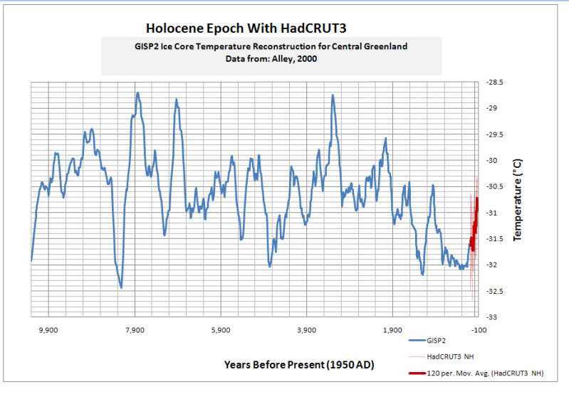 |
| Reconstructed paleotemperatures for Holocene Epoch Central Greenland Ice Cores |


Excellent article that I didn't really understand. I'm always amazed at how statistics simply muddle my brain. I wonder outloud how many Climatologists suffer from the same issue and use the simplest statistical calculation possible in order to produce a graph, any graph for their presentation.
ReplyDeleteBTW: Can you add a "global warming" tag to this? On the very rare occasion I get asked why I'm a CCD (Climate change denier) I follow the tags backwards.
This is not evidence that global warming is wrong. (We can only hope it is right. A colder earth kills. And we are perilously close to the lower CO2 limit where photosynthesis shuts down.) The point is the perils of model-building. That's why I used an example from my professional past rather than climate, per se. To a statistician, things that appear different in subject matter can be very much alike in structure. It is much easier to understand the problems using a neutral example than an example in which one has righteousness invested.
Delete"There are people who just need a cause that’s bigger than themselves. Then they can feel virtuous and say other people are not virtuous."
-- William Happer, physicist, Princeton